Design Trends We're Over for 2022
A new year brings talk about new trends, and what’s in, in the world of design. It also begs the question, what’s out? As designers we see a lot. We’re exposed to ideas, and aesthetics on several platforms, and we’re constantly being inspired by new design styles, details and ideas. On the contrary, we also find ourselves moving on from past trends a little faster than others, simply due to saturation, and the world we work in. I expect fashion is no different.
While it’s fun to talk about what’s new and next (don’t worry, that blog is coming), it’s also worth looking at trends we feel wouldn’t be so bad to say goodbye to. Here are our top four.
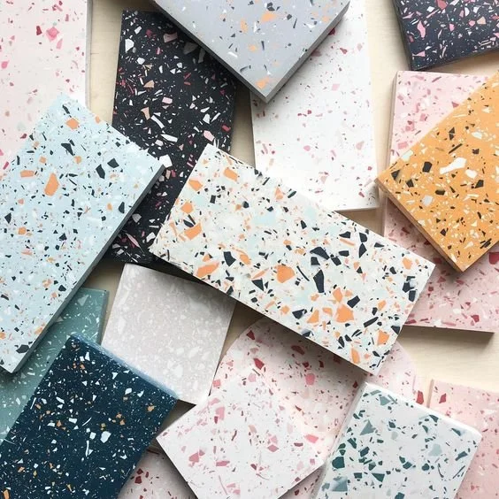
TERRAZZO TILES
Terrazzo has been around since the 15th century so it’s certainly seen its fair share of being in and out of style over the years. It’s also been reincarnated each time it returns as a trend, giving it a new lease on life and fresh look. This terrazzo vibe has been around for a few years now and we feel, reached its shelf life for the time being. It’s time for it to be put back in the archives. It’s been done, and over done. Time for something new and fresh to take centre stage!
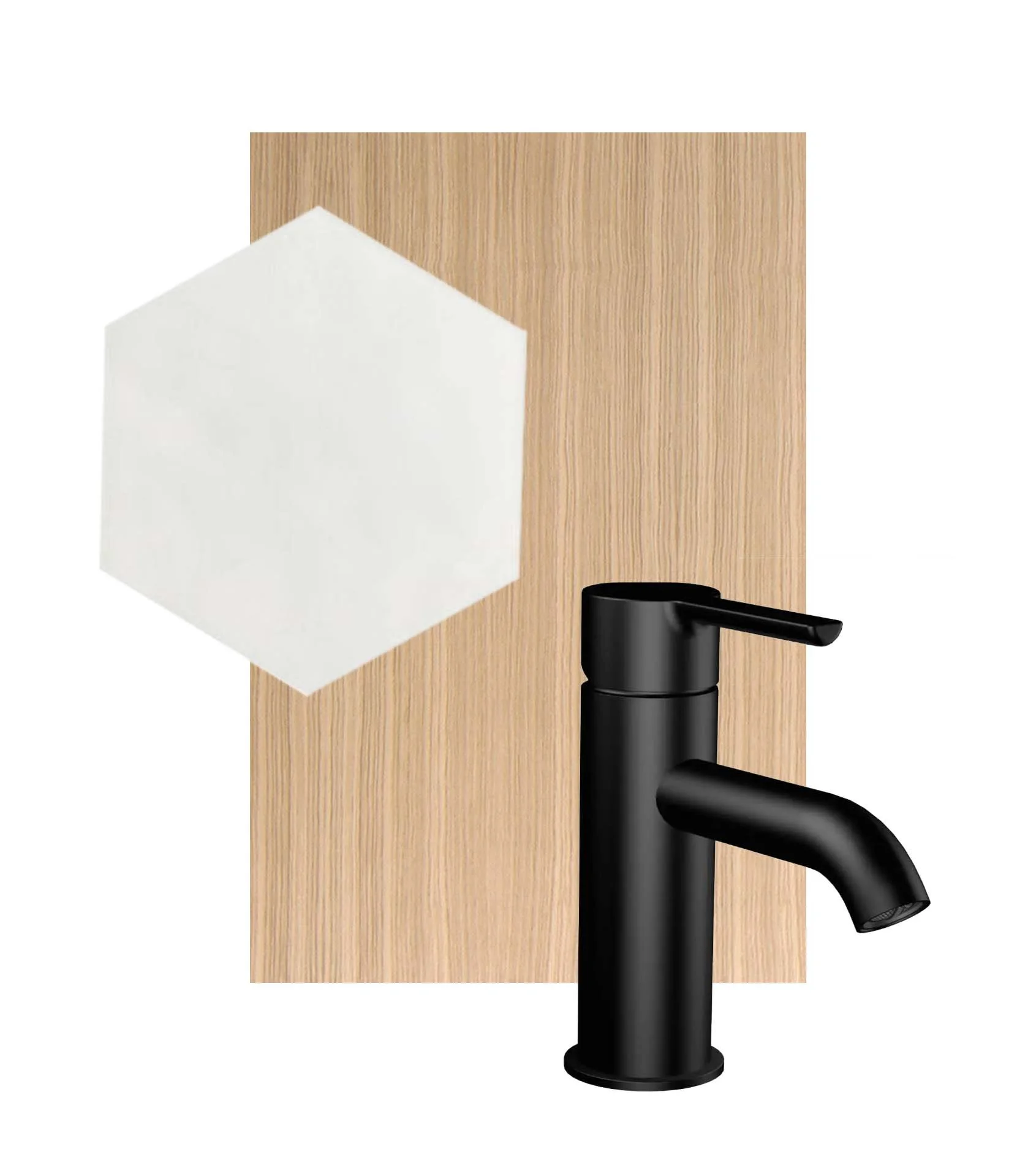
THE WHITE, BLACK, & WHITE OAK COMBO
This is perhaps the most controversial of the bunch, however we’re going to put this out there; it’s time to move on from the white, block, and white oak combo.
The trajectory in which this look rose to stardom was fast, really fast, and then it was everywhere. Don’t get us wrong, it’s a lovely grouping of materials, but we feel as though it’s seen its day.
It’s unfortunate when something gets saturated so quickly. It gets harder and harder to reinterpret it over, and over and over again. There’s only so much you can do with it. Individually, these materials are great, and we’re happy to see them used in design, we’d just love to see them mixed with other materials that push the envelope a little more.
SAFE INTERIORS
There is safety in recreating spaces. There is reassurance in being able to visualize the end result when we’ve seen it before, whether in person, a magazine, Pinterest or Instagram. Designers have the skill of visualizing a space, which is a huge part of the reason we’re hired to work alongside our clients. We get a visual of the design in our mind, and are able to make selections accordingly. Visualization is a huge part of our job, seeing what our clients can’t, and want we’ve conjured up in our creative minds. Equally as important, is designing spaces that are true to our clients, and not taking a cookie cutter approach to design.
When spaces are recreated, multiple times, it results in monotony. Risk is hard, it’s scary, it’s uncertain. but nothing is more important in design than a space that is built around you, your family, your lifestyle, your budget, and that’s different for everyone, meaning design should be as diverse as the people we’re designing for. Take the risk. Do something no one else has done. Trust your designer. You won’t regret it!
UNINTENTIONAL ROUND ARCHES
Much like terrazzo, arches have been around for centuries. We love them, however we also feel the round arch has reached a point of being over done, and used in areas (and often multiple areas) that feel less than intentional.
When a trend catches on, it’s a little like wildfire, and spreads like crazy. We’ve seen arches in bookshelves, windows, doors, ceiling details, mirrors, bed frames, and paint features on a wall, to name a few.
In our humble opinion, it’s time to pare back, and use this architectural detail with more thoughtful intention, or switch up the style from a round arch to a three centred arch, or a pseudo three centred arch.
We love this detail, but arches have become much like a new favourite song that gets overplayed.


