Design Evolution: Nyla’s Open Riser Stairs
I vividly remember the first time I walked into our home. It was light filled, and spacious, largely impart to the open riser, central stair case, and generous west facing windows.
While the stairs were one of the things I was immediately drawn to, they were also quite unattractive. I guess you could say, I saw their potential! As shown below, dark wood, carpeted stairs, outdated spindles, and curved edges (ugh!), all contributed to the unsightly visual.
Located in the middle of our main floor, not only are they a focal point, can be seen from almost anywhere in the house, but they’re also the first design detail you see when you walk through the front door.
The above photo shows the area I struggled with the most, a triangular shaped landing, and angled stairs. We had several meetings about straightening out the stairs to remove the angled jog, however it wasn’t possible without removing the entire staircase. From a budget, and logistic perspective we needed to figure out a plan B. We decided to eliminate the curved edges on both sides, hardwood the treads, and update the railings and spindles.
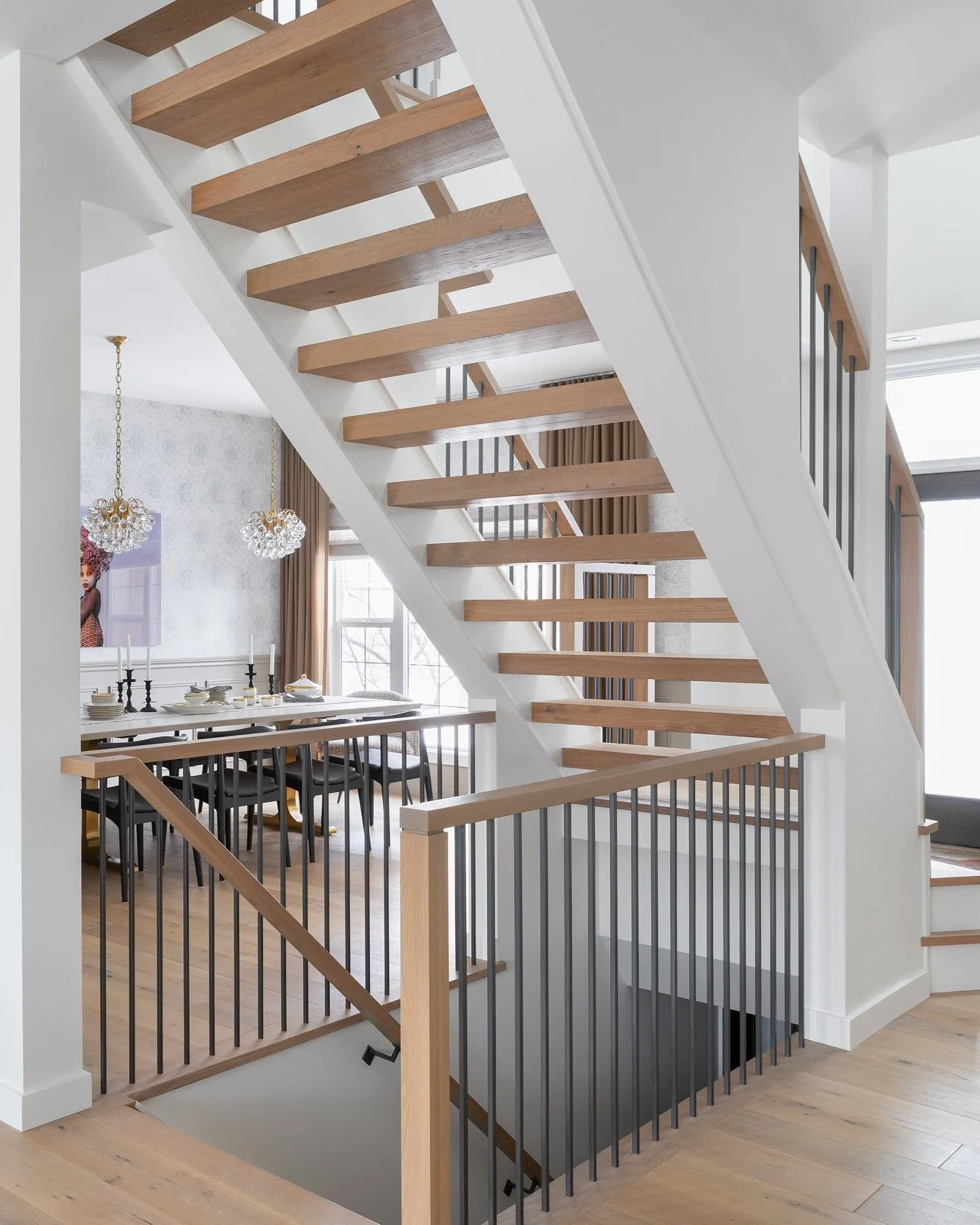
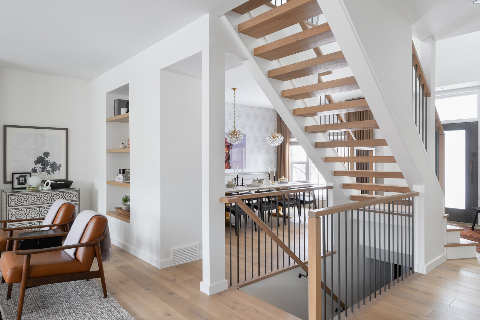
Everything was removed with the exception of the stringers and treads. The previous dark maple wood was painted white, treads were clad in hardwood and the rest was new.
The new spindles were installed directly into the hardwood, creating a clean, seamless look, and while they arguably look black in the photos, they’re actually a warm “off-black” providing a slightly softer feel.
The railing is similar in proportion to the posts, also offering a visually connected feel as one flows into the next.
We opted to keep the overall look, and feel of the stairs minimal and clean. They’re architectural in and of themselves, purely because of their location, and visibility from all sides. Unless, you’re in the pantry, there really isn’t a spot on the main floor where you don’t see the stairs, so they needed to fit well into the aesthetic, and not necessarily be the show stopper of the main floor.
Open riser stairs are certainly a conversation piece, as some feel quite uncomfortable with their openness. As I mentioned, it’s one of the first things I fell for in the home, and I still love them, especially now that they’re feeling fresh and new!
Have an area in your home that feels old and tired? We’re up for the design challenge to give it new life! Get in touch with us via our contact page. We’d love to connect.


